Call-To-Action Buttons That Convert
By Lindsay Valenty -
Digital marketing, whether for an eCommerce shop or a business, lives and dies by how compelling your CTA, or Call-To-Action, is.
What is the importance of a CTA?
Any time you send a communication to a potential client or existing customer, it's essential to give them a reason to engage. Otherwise, what's the point?
A compelling CTA generates responses.
Be An Action Star
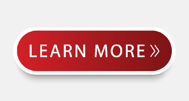
Instead of using words like "enter" or "submit," use more actionable words such as "get" or "try."
Examples include:
• Book A Meeting
• Reserve Your Spot
• Get Your Free Quote
Color Matters
We understand that companies may have brand standards they adhere to and a certain number of colors to choose from, but trust us on this one.
If you want your CTA buttons to grab and keep your readers attention, the best performing colors are green and orange.
You want to make sure that any colors you choose are complimentary to your design and color theme, not to mention you want to ensure you have proper contrast for accessibility. Still, studies have shown that green and orange perform best.
Bonus tip: you can also use graphics in your buttons. Make sure the pictures fit what you're selling, the icons make sense, and they aren't too copy-heavy.
Shape Your Success
Believe it or not, the shape of your button also determines how well your CTA performs. There is no exact formula, but a recent ContentVerve test found that a rounded green button performed higher than a blue rectangle. Who knew?
Text It To Me
When it comes to text and fonts, keep things simple. Ensure the copy is short, actionable, to the point, and most importantly, easy to read.
The ideal number of words on your CTA button should be from 2-5: anything over that is overkill.
Bonus tip: the word "Free" is a powerful motivator for some people. You can always do an A/B test with your email campaigns to see if adding the word "Free" to your CTA increases engagement and CTR.
Above the Fold
For those who may be unfamiliar, this newspaper term means that, ideally, you want your CTA to be on the top half of your email/landing page/website along with pertinent and vital information.
Think of a pyramid. The top is the most crucial part; the farther you get in your email, flyer, or newsletter, the less pressing the content becomes.
Test, Test, and Test Again
Even with all of these tips and tricks we've shared, there is no magic formula. The most effective CTA button will be unique depending on your market, strategy, offer, etc.
When generating any campaign, we recommend doing an A/B test. The most important thing to remember with an A/B test is to switch up ONE variable: color, copy, shape of the button, offer, etc. If you change too much in one campaign, there will be no way to determine which change garnered the best results.
With so many new developments going up each month, the competition for renters and buyers is tough. Building, listing and showing just isn’t enough. Whether you’re a real estate developer putting up student housing, luxury apartments or boutique studios, your new development needs a strong brand identity to stand out from the crowd—and we'll give you an edge over the competition.